New · Now serving the macro environment

The economy, graded.

You grade your stocks with us. Now grade the water they swim in. The Macro Dashboard reads 38 official U.S. economic series — jobs, inflation, growth, credit, housing — and turns them into two things anyone can read: which of four economic seasons we're in, and a letter grade for how favorable conditions like these have historically been. Published arithmetic, tested against 29 years of history, warts printed on the label.

Macro Regime
1
2
4
3
Regime 1 — Goldilocks
Growth accelerating, inflation cooling
Macro Grade
B+
76 / 100
calibrated on 29 years of history — bands frozen, never quietly retuned
The Ribbon
355 months of regime history
every month since 1997, classified by the same published formula
№ 01 · Four seasons, one square

Where are we? One glance answers it.

Economies move through recognizable seasons, set by two questions: is growth speeding up or slowing down? and is inflation heating up or cooling off? Two questions, two answers each — four regimes:

1 · Goldilocksgrowth up, inflation cooling — historically the friendliest water
2 · Reflationgrowth up, inflation heating — expansion with a price tag
3 · Stagflationgrowth down, inflation heating — the hardest season
4 · Slowdowngrowth down, inflation cooling — the cooldown

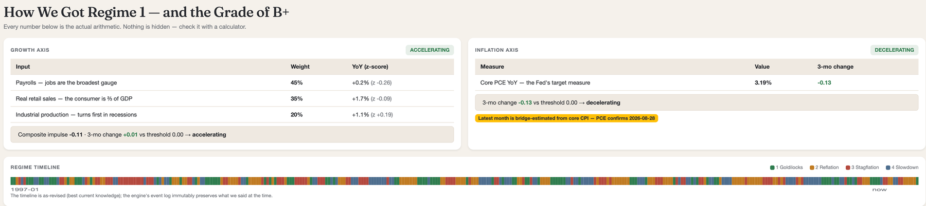
The growth answer blends three official gauges — jobs (45%), consumer spending (35%), industrial production (20%) — and the inflation answer reads the Fed's own preferred measure. No committee, no vibes: the regime is the arithmetic, and the arithmetic is published. Professional macro funds run frameworks like this on expensive terminals. Yours comes with your account.

№ 02 · The grade — tested before you ever saw it

A letter grade for the economy. With receipts.

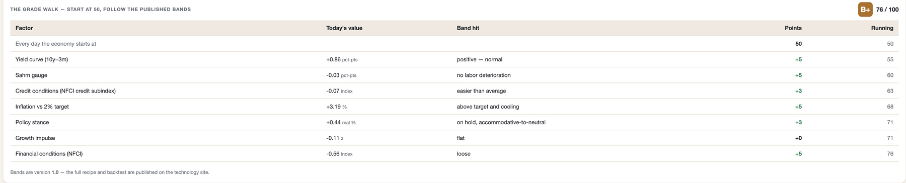
The Macro Grade works exactly like your stock grades: start at 50, walk through published factor bands — the yield curve, jobless claims, credit stress, the Sahm rule and more — and land on a letter. Before we froze the formula, we ran it against every month since 1997 and published what we found, including where it fails:

  • It warned five months before the 2001 recession.
  • In 2008 it fell hard — but bottomed just above the warning line. We print that, not hide it.
  • It cannot see pandemics. Nothing in macro data could have called March 2020, and we say so.
  • It cried wolf once in 2022–24 — along with most economists. That false alarm is on the label too.

The bands are frozen at version 1.0. If we ever improve the formula, the version number changes in public and the new formula re-runs the same 29-year gauntlet first. No quiet retuning — a grade you can compare across years, because it's the same ruler.

№ 03 · Drill to the source

Every number traces to the government's own data.

The headline is a grade; underneath is the whole machine. Tap the regime to see exactly how it was computed this morning — every weight, every threshold, every input. Tap any theme — employment, inflation, growth, rates, credit, housing — and drill into the 38 underlying series: decades of history, recession shading, and machine-learning projections for the next 3, 6, and 12 months with honest confidence ranges.

Source: FRED, Federal Reserve Bank of St. Louis. No human touches the numbers between the government and your screen — and the dashboard tells you the moment any series is stale.

№ 04 · What seasons like this have meant

The Regime Playbook. History, not hunches.

Knowing the season is half the value. The other half: what has historically grown in this season? The Playbook joins our 29-year regime timeline to real sector returns and shows, for the current regime, which sectors were tailwinds (outpaced the market in these months) and which were headwinds (trailed it) — with the sample sizes and hit rates printed beside every number.

And because we grade companies for a living, one layer deeper: Quality Across Regimes — how graded companies actually returned in each season, across ~500 companies and two decades of filings. What the data shows: A-graded companies beat the market in all four regimes — and in the hardest one, the Slowdown, they were the only meaningful grade cohort that did. Every cell carries its sample size, and the known biases (today's index only contains the survivors) are printed on the label, not hidden under it.

Everything here is a description of what happened in months like these — not a forecast, and not a recommendation. We publish the history; the decisions stay yours.

№ 05 · Don't trust our weights? Move them.

The Macro Lab.

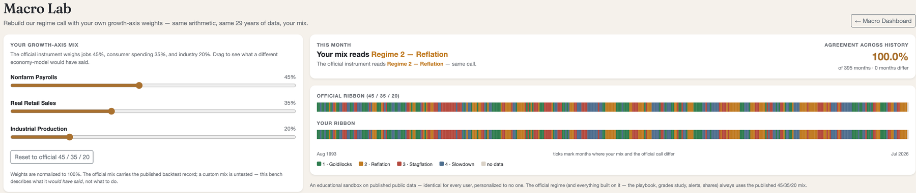
Most tools ask you to trust their formula. We hand you the sliders. In the Macro Lab, drag the growth-axis weights yourself — more weight on jobs, less on industry, whatever economy-model you believe in — and watch the entire 29-year regime timeline rebuild instantly next to the official one, with an agreement score and every disagreeing month flagged.

It runs the same arithmetic as our engine — literally the same code. What most people discover: reasonable weightings barely change the calls. The instrument isn't balanced on a knife's edge, and now you don't have to take our word for it.

№ 06 · Share the picture

Send the economy to anyone.

One tap creates a link that pins the dashboard exactly as you see it — regime, grade, playbook and all — and anyone can open it, no account needed. The live dashboard keeps moving; your shared snapshot doesn't. Perfect for the group chat that argues about the economy, or for "this is what I was looking at when I decided."

There's also Ask Claude, right on the dashboard: ask why the inflation axis flipped or what the yield-curve factor means, and get an answer grounded in the exact numbers on your screen.

Included free with every account

Your stocks have grades.
Now the economy does too.

The Macro Dashboard is included with every Grade My Investments account — free tier included. Sign in and it's in your Reports menu, updating itself on the government's release schedule.

Try GMI Free — No Credit Card